

Design Problem
The listen page is Smule's core content discovery page, and receives the second most visits of any single page, second only to the homepage. Much of this is organic traffic from Google search results. However, the conversion of visitors to content-listeners was quite low.
Visitors did not understand the nature of the content – that it is comprised of recordings created by Smule app users and uploaded to the Smule web platform.
The design did not encourage song playback – a text-dominated catalog of song titles was not fun to interact with.
Solution
More engaging user interface: Design an in-line player with much more prominent album art and video players, rather than a long text list.
Better explanation of content: Visually emphasize that content is created by Smule app users, and that these recordings are not by the original artists (with the exception of Partner Artists playlist).
Improved information hierarchy and ease of navigation: Change the playlist navigation from a long vertical scrolling page to horizontal tabbed navigation fully visible at the top of the page, where all groups of playlists are given equal visual weight.
Focus on quality and credibility: Strategically place quality-indicative song stats – listens and loves – right on top of the album art.
Quantity: Carefully curate and limit how much content is shown on screen at one time so that visitors don't spend time scrolling through a long text list of potentially unfamiliar content.
Improved nomenclature: Give playlist groups meaningful names so that they make sense to people outside of Smule.
Impact Metrics
The new design increased unique song "listens" by more than 300%. The initial target was to increase the rate by 20%. There was also a massive increase in recording shares.
My Role: All design discovery and research, UX design, prototyping, user testing, 75% of visual design.
Process
Preliminary user testing
Rather than make assumptions, I went straight to the users for input on the existing page's most significant shortcomings. Participants included desktop, mobile iOS and Android platform users.
Below are the old screen designs used in preliminary user testing.
Findings
User testing revealed distinct shortcomings in the existing desktop and mobile designs:
Nature of content not clearly communicated – It was unclear to nearly all testing participants that the songs in the song list were not recordings by the original artists but rather covers of amateur singers and musicians made using Smule apps.
Design is not engaging – Presenting a playlist as a vertical text list with small thumbnail album art did not encourage user interaction.
Titles of groups of playlists were unclear – "Featured," "Categories" and "Best of" did a poor job of communicating the content contained in each of those three groups
Navigation and information hierarchy – Playlist navigation required vertical scrolling approximately 3 times the page height in order to access all options. Playlist groups below the fold, which were easily overlooked, were not all at the top of the information hierarchy.
Playlist navigation discoverability [mobile] – Navigation to other playlists was hidden in a confusing icon in the top right, and most users missed it altogether.
Screen real estate – Large dark grey banner at the top occupied a lot of real estate and contained nothing actionable.
New design – early wireframes, rough sketches


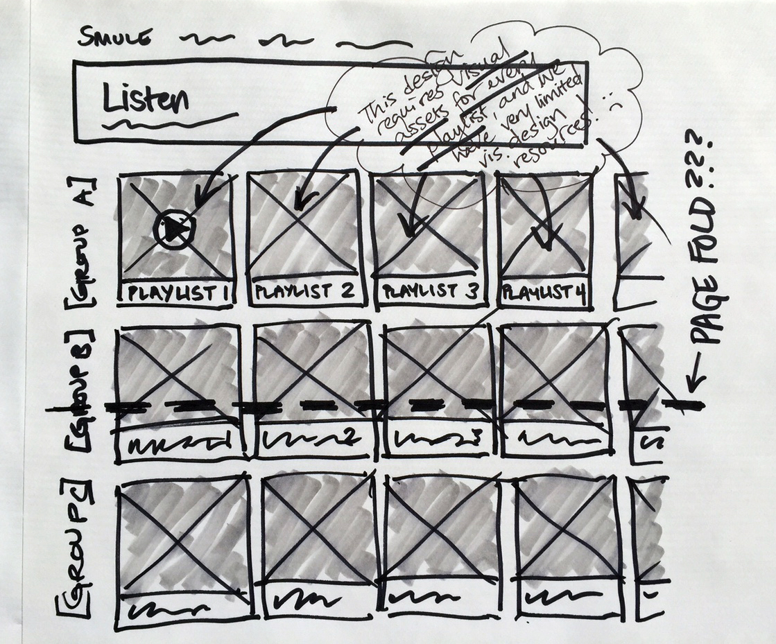


Using real-life performance interaction as inspiration
By publicly sharing their vocal performances created using Smule apps, these amateur musicians are "stepping forward" into the spotlight from within the greater community of Smule app users. I immediately thought of an a cappella group or a barbershop group, in which a soloist steps forward on the stage so that his performance is both visually and audibly highlighted.
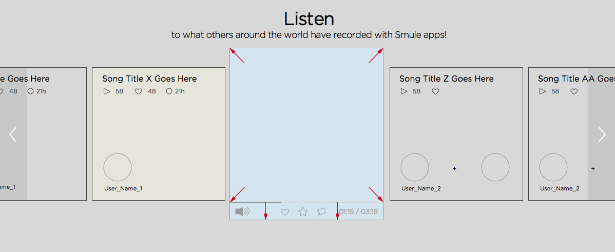
On the Listen page, my concept was that starting playback of a particular song would trigger an album art cell or video player cell to "step forward" from a ribbon of other performance album art cells, scale up and take "center stage."

More design iterations – wireframes in Sketch
Iterations on rough sketches
Ways to make mobile navigation more discoverable and easier to use
Album art/video players large and prominent while focusing on the "center stage" idea
Exploration of desktop navigation: Desktop playlist navigation is directly below the album art ribbon at this stage
Increased focus on user profile information to convey content type


Animated transitions: Clicking to start playback on an album art cell causes the album to slide into the "now playing" position, then scale up as though stepping forward from the album art ribbon. Finally, a panel containing the song title and complete recording information animates out to the left, pushing the preceding album art cell to the left and off the screen. The latter animation was not implemented in the final design, due to constraints in developer resources and time.
Final Design
Information hierarchy – Playlist navigation was moved from beneath the album art ribbon to the top, for a clear vertical hierarchy:
Playlist groups, with more descriptive titles – Smule Playlists, Musical Genres and Best of Smule Apps
Individual playlists within those groups – Genres was reduced from 18 to 12 lists to reduce clutter
Individual recordings in the album art ribbon
Key design elements:
Visual interest over mere text: Large album art (or in-line video player), more prominent song stats (plays and loves = quality content)
Content explanation hinting: Added user profile pictures on top of album art for greater emphasis on user created nature of content
Fun interaction: Album art slides into the "now playing" position on click, while scaling up as though stepping forward to take "center stage"
Best content surfaced on page load with new Partner Artists playlist
Limited quantity shown before scrolling so as not to overwhelm visitors with a sea of unfamiliar content
Combined functionality: In-line player with simultaneous content scrolling. During song playback, the enlarged album art or video player remains pinned in place at left, and users can scroll through the album art ribbon, which slides beneath the "now playing" song cell
Specs – desktop


Annotated flow – mobile

Redlines for mobile
Screen real estate was a major challenge for smaller devices in this design. I specified a breakpoint based on detecting device screen size, with differently proportioned screen elements for larger and smaller screen sizes.
iPhone 6+, iPhone 6, iPhone 5 and iPhone 4
High-fidelity mocks
Desktop design

New Smule.com/listen/ desktop design
Key mobile screens
mobile media player screen
mobile menu button press state
navigation – Smule Playlists open
mobile nav – Best of Smule Apps
Post-Release
User testing – Final round, QA
I recruited participants for a final round of user testing, some of whom had participated in the first round, and asked them to compare the new design to the old one.
Feedback:
Users found the new design to be more fun to interact with, more visually appealing, and much more clear in communicating that the performances were created by users of Smule apps.