
Problem
As a continuation of the Vehicle Reliability project, a car comparison tool was needed. Research and user testing throughout the Reliability project revealed users’ desire to compare ratings and pertinent data between different cars, especially when researching vehicle purchases and planning for repair and maintenance costs.
Solution
Design and implement a tool that allows consumers to easily compare the Car Reliability score and score components of two cars, on both mobile and desktop. This includes:
An easily digestible, side-by-side 2-column view of both cars
A high level view of overall reliability scores
A granular breakdown of those scores into their three primary components
A UI design to easily change one or both cars being compared, and the ability to go back to a single car view
Eventually, this comparison tool was ported over to the Car Overview page by the consumer product team and other data was added, such as common repairs and costs, and consumer car reviews.
My role: All design discovery and research, UX design, user testing and visual design.
Process
1. Research
I began by researching comparison tools on various websites – not just automotive information, but retail sites such as clothing, home goods and furniture, and home improvement stores such as Home Depot.
I noticed an interesting trend: Many companies have comparison tools on their desktop sites which are simply not available on their mobile sites. With mobile devices comprising well over 70% of RepairPal’s consumer website traffic, it was imperative that RepairPal have a visually clean and easy to use comparison tool that performed well on mobile phones.
REI product comparison – available on the desktop site only, not the mobile site
Home Depot product comparison – available on the desktop site only, not the mobile site
2. Revisit designs and research from a previous related project
The Repair Cost Index Score (or RCIS, for short) also involved a UI for scoring vehicles. The design for displaying the score for a single vehicle at a time had been implemented by engineering. However, the designs for comparing the Repair Cost Index Score for two vehicles in a single screen was still in the engineering backlog. With much design research and user testing already invested in that comparison tool, I revisited those designs, shown here:
RCIS car comparison – mobile
Due to limited space, all data points – both cars as well as an average score – occupy a single bar graph

Repair Cost Index Score car comparison – desktop design
Plenty of screen real estate, so each car’s score has its own bar graph

3. Mobile comparison UI iterations and user testing round 1
Ample screen real estate the desktop experience allows for multiple workable comparison UI solutions. However, an easily digestible mobile UI is a bigger challenge, due to
Limited horizontal screen real estate and the amount of content, which poses challenges to a side-by-side comparison
The amount of vertical scrolling required to view adequate information about both vehicles, which poses challenges to a vertically stacked comparison
I created three low-fidelity mockups which displayed information for two selected cars in various ways: a vertically stacked design, a two-column design, and a hybrid of the two, which was quite similar to the Repair Cost Index Score layout for mobile (see above).
Mobile comparison – vertically stacked design (basic stacked concept submitted by others)
Mobile comparison – hybrid design (design concept done by me)
Mobile comparison – side-by-side design (design concept done by me)

Takeaways
The side-by-side column layout was the clear winner in user testing, both online and with colleagues in the office.
The UI must minimize the user’s cognitive load. Any confusion regarding which information belonged to which car (data visualization and text) detracted from the experience.
Notes:
1. The vertically stacked design required far more scrolling than the other designs – about 3 full screen heights. This put the burden on the user to remember the data points for one vehicle when scrolling to the other in order to make an effective comparison. This proved to be awkward and ineffective, and not much more helpful than navigating between two different single vehicle score pages.
2. In both the hybrid and side-by-side versions, users likes being able to compare two vehicles side-by-side at both a high level and granular level without scrolling and without having to remember data points.
3. In the hybrid layout, when two data points occupied a single graph and Make/Model 2 appeared before Make/Model 1 on the bar, it became more challenging to distinguish which data point belonged to which car.
4. In the hybrid layout, two data points occasionally overlapped each other, making them difficult to distinguish.
5. Side-by-side bar graphs made the UI a little more cramped, but users did not have difficulty understanding which data points belonged to which car.
4. High-fidelity mocks and user testing round 2


Takeaways
A. Confusion after scrolling on mobile
While the mobile side-by-side column comparison UI was strongly favored by user testing participants, one additional weakness was revealed.
Testing revealed that users could easily forget which two cars they were comparing, or which car was on which side, once the car images and model names scrolled off the top of the screen. This was especially true when a person executed several car comparisons in a single session.
A sticky car make/model heading was needed at the top of the screen for the mobile design. This could include car images, make/model names, or both.
B. ‘Change Cars’ UI
The interface at the top for changing cars – while similar to the UI on such sites as REI and Home Depot (which only have desktop comparison tools) – would benefits from simplification for a mobile application.

5. Sticky make/model header – scrolling animation states (mobile design only)
Objective: Make the top car image and make/model caption collapse into a sticky bar at the top of the screen, with content passing underneath it. This way, cognitive load is reduced and unnecessary up/down scrolling is eliminated so that the user may simply focus on the page content.


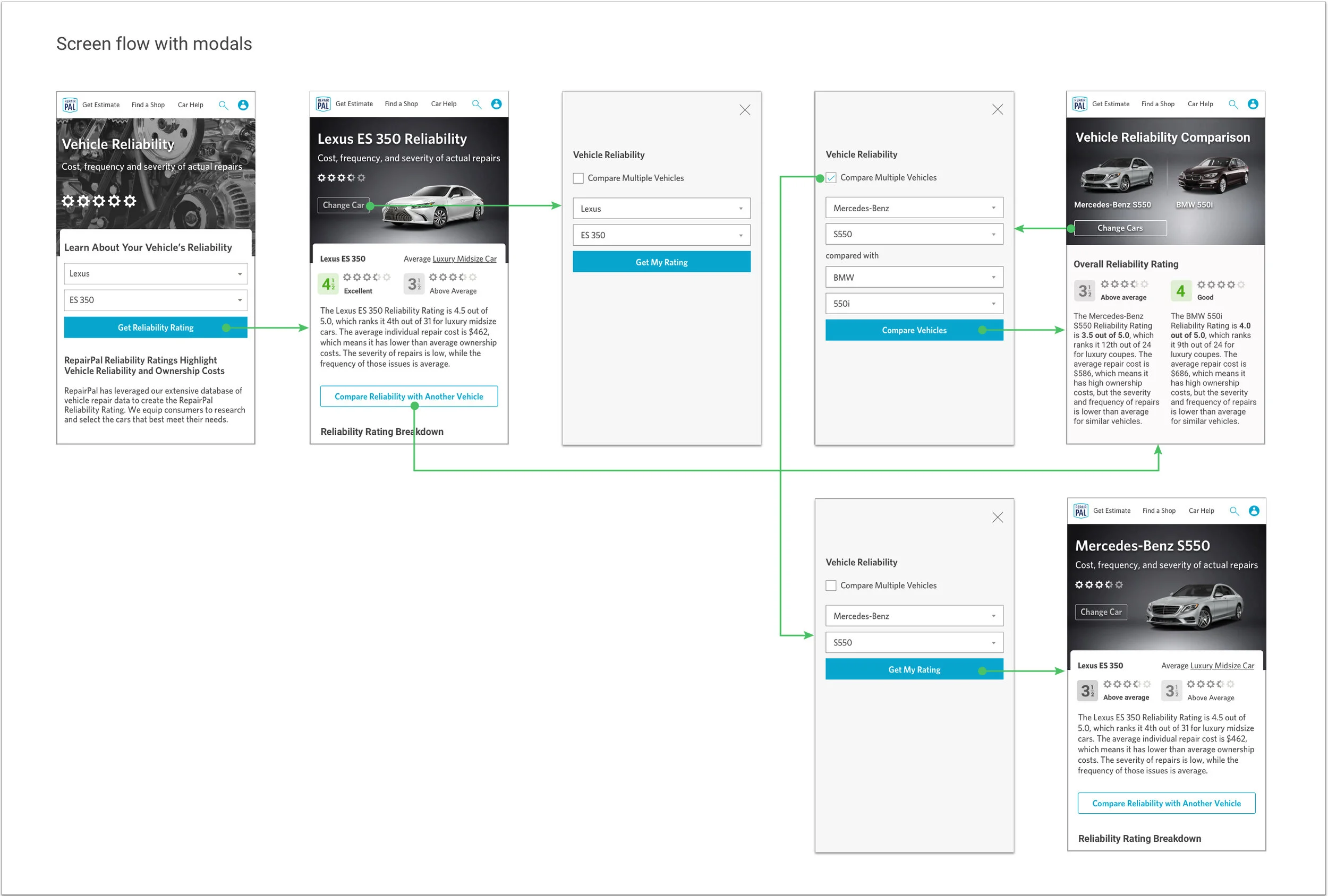
6. Change car / change comparison modals
Along with the comparison designs for Repair Cost Index Score, I had also completed designs and behavior specs for ‘change’ modals designed for maximum flexibility in user behavior and minimal clicks and view states.
Easily switch back and forth between a single car view and a two-car comparison view
Change only one car of two in the comparison view
Prepopulate make/model information in the change modal so that either car could be changed, or only a model could be updated without having to re-select make, as users often compare a single car against many others or seek information on several models within the same make (brand)
Compare modal with first make/model prepopulated in the form
Modal with ‘compare’ unchecked, allowing user to easily switch back to single car view
Final Mocks
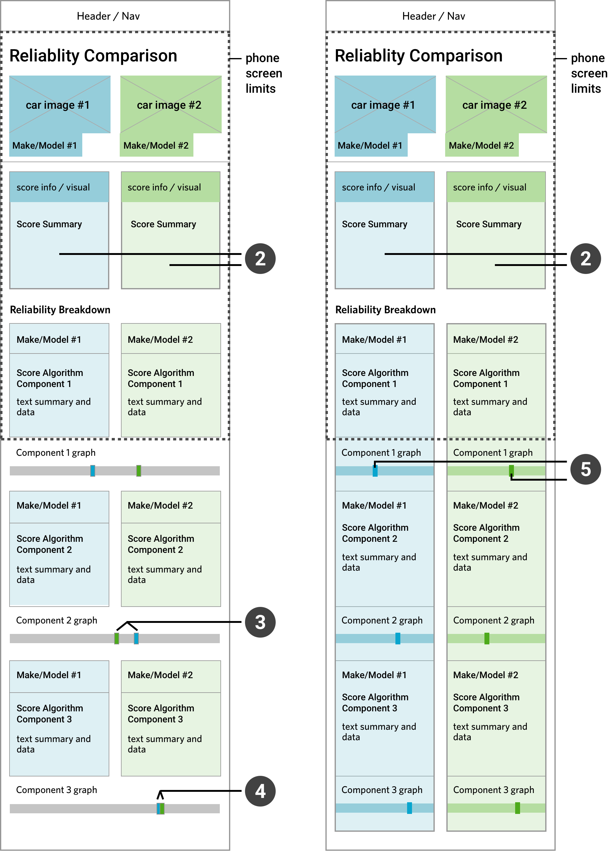
The 2-column layout for mobile required a few more iterations. Placement of the icons on each end of each of the side-by-side bar graphs made the design feel visually cluttered. I removed these from the bar graphs and place a single icon next to the heading for each component section.
A ‘Send Reliability Comparison’ CTA was added below the reliability breakdown graphs so that the comparison details could be sent via email or SMS.
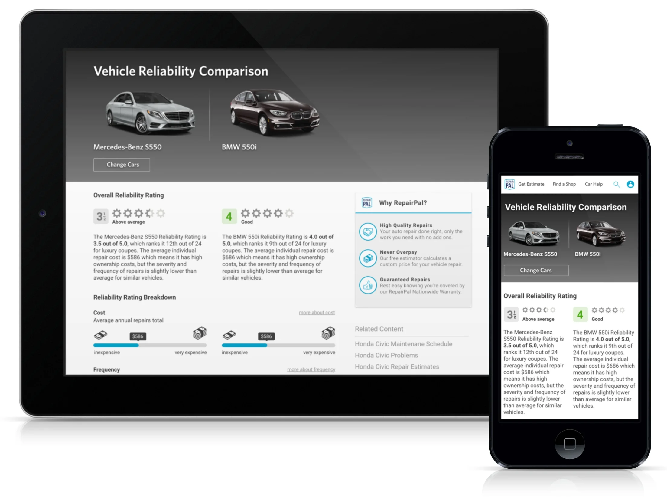
Comparison – mobile design

Make/Model sticky top after scrolling
Comparison – desktop design
Future product features:
A future update would allow users to compare more than 2 vehicles simultaneously on desktop.