Design Problem
The Shop Dashboard design project was a significant undertaking to create and deploy a completely new B2B product for over 2000 automotive repair shop owners in the RepairPal Certified network.
The existing shop Portal was not responsive (and nearly impossible to use on a mobile phone), extremely dated looking and cumbersome to use. Frequent assistance from account managers was needed for many shop owners to complete basic tasks, and that time was needlessly wasting company resources.
Solution
The new Shop Dashboard allows shops to track and respond to all their RepairPal customer activity using a clean, easy-to-understand interface, even for the least tech-savvy of shop owners.
Customer Tracking & ROI – key statistics in home page summary data visualization
Simplified information architecture and navigation
Greatly improved surfacing of new business leads and important action items via activity highlights on the home page and notification badges in the top level nav
Responsive, with key sections optimized for use on mobile phones
Impact
Shop owners feedback
It takes less time to complete important tasks in the midst of hectic repair shop environments
The all new Home screen gives them a valuable and easily digestible snapshot of their return on investment in a matter of seconds
RepairPal account managers feedback
The clean, modern interface eases day to day operations as they work with shop owners over the phone
Metrics
While there was only a slight increase in Dashboard use within the first two months, session times increased, indicating more productive time in the Dashboard.
The true measure of success was anecdotal reports from account managers 1) having to make a steadily decreasing number of calls to shops each month reminding them to complete essential functions like verifying tows, and 2) receiving fewer calls from show owners asking for assistance in completing tasks.
My role: All UX design and user testing, all final specs for engineering, 80% of visual design. I also conducted brainstorming and feedback sessions which included internal stakeholders such as shop account managers, product managers and the VP of Shop Network.
Process
1. Discovery
Stakeholder interviews to identify needs and pain points
In-house: Account managers and general manager of the shop network – Understand which parts of the Portal shop owners reported struggling with the most, pain points, which parts they felt were the most unwieldy
On-site at repair shops: Empirical research observing shop owners using the existing RepairPal Shop Portal in their hectic, noisy, daily working environment
Online surveys: SNAP network survey (a select group of 20 shop owners across the nation) to identify needed features, understand what was confusing and difficult to use
Competitive Analysis
What other shop management tools and software are shops using?
I investigated the features and interface of such products as
Kukui
Shop-Ware
Takeaways
Shop owners don’t understand what important things need to be done. Need to greatly improve surfacing of action items
No way to evaluate return on investment in the RepairPal Certified program without digging in and spending a lot of time – something shop owners do not have
Portal interaction is seen more as a necessary evil than an experience that provides value, insight and delight
Poorly considered touch points: Shops owners have to be repeatedly reminded through emails and calls from their account managers to log into the Shop Portal to verify tows and complete necessary interactions, resulting in wasted time and resources
How do shop owners get to the Portal? Most shop owners aren’t even sure how to sign into the Portal without either 1) being guided over the phone by an account manager, or 2) clicking on a deep link in an email that only takes them to one action item on a specific page, rather than an overview of action items… and that’s if they even open the email!
Missing out on useful training tools: All but the most determined shops ignore the Calls recording review tool due to an unwieldy interface.
Need sorting and filtering options for major pages such as messages, tows, calls and bookings
2. Understanding the interrupt-driven shop owner
Interviews with actual shop owners revealed a wide range of technological confidence amongst shop owners. Some shops were using PCs with old versions of Windows and IE as their browser. Others were heavily dependent on smart phones, using apps to decode Vehicle Identification Numbers (VINs) and track parts shipments.
I also observed first-hand that they are all interrupt-driven – multi-tasking in very busy environments with frequent interruptions – and would benefit from spending less time in the Dashboard.
Takeaways and strategy going forward
One of the most challenging parts of this project was gaining a true understanding of the customer engagement ecosystem. Few shop owners were willing to schedule the time for an in-person interview. In an industry historically underserved by quality digital products, shop owners weren’t always able to clearly articulate what their needs were in such products. It became clear to me that I needed to spend time with those RepairPal employees who interacted with them on a regular basis, as they often had the best insights into shop owner pain points and product needs.
One thing was painfully obvious to everyone involved: Time is at a premium when running an auto repair shop and efficiency is critical to the bottom line.
Fewer, more productive visits to the Dashboard became one of my primary objectives.
3. Existing shop portal: Feature inventory and full site heuristic evaluation
I began by completing a highly detailed heuristic evaluation of the existing Shop Portal, including
Information architecture
Functionality – identification of primary and secondary tasks
Identification of broken and malfunctioning items
Visual design and branding
Nomenclature – Consensus within the office was that “portal” sounds dated. “Dashboard” sounds more modern and is, of course, appropriate alongside automotive content.
Information Architecture and Site Maps
The core of the shop portal overhaul was rooted in information architecture.
I created a site map of the existing portal, the organization of which was very shallow and required vertical scrolling to see all of it. During the heuristic evaluation, I identified which areas of the Portal could be combined and which could be totally eliminated.
Next, I proposed a new site map and navigation structure, with a greatly reduced number of categories which would all be viewable at one time, with carefully chosen nested subcategories.
Rarely used features are removed from the primary navigation structure and nested under the sign-in/profile area, including onboarding info, settings, payment and billing information, and various tools and widgets for enhancing one’s shop profile.
Navigation
Site maps inform final navigation UI designs
Horizontal top navigation tab bar (desktop), and grid nav (mobile) with critical action-item sections surfaced. In each case, I made all navigation items viewable in a glance, without scrolling.
The final design introduced a new deep shade of blue to the RepairPal style guide, reserved for use with Shop Dashboard related designs and communication only. I created icons for each section and introduced new notification badge functionality.
Mobile navigation
4. Heuristic evaluation of individual pages
Old portal home page (one example of many pages in this exercise)
The old portal home page contained non-essential, outdated information, and even a non-functional widget!
1. Navigation header and footer from consumer website directs shop owners away from Shop Portal rather than directing focus on shop tasks
2. Accordian-style side vertical navigation occupies important screen real estate. Information hierarchy is shallow and poorly organized. Some tabs are actually broken.
3. Home screen content is both outdated and irrelevant to important tasks to be completed. Provides nothing of real value.
4. Profile status and activity are de-emphasized. Functionality is broken.
New home screen design
Snapshot of ROI (return on investment) – does not exist anywhere in the old Shop Portal
Action items which need attention or verification
Acknowledge accomplishment – highlight tasks recently completed
User interface iterations
Timeline/feed or mosaic of cards?
Summary of most important sections or new data visualization features?
‘The Feed’ – Timeline of recent leads and actions
Stakeholder feedback: Feels like yet another daunting ‘to-do’ list
Mosaic of cards – Cards are a combination of recent activity across site, and ROI visualization
Stakeholder feedback: This combination is most useful to shops as there is variety of information
Mosaic of ‘Monopoly Cards’ – Each card contains a summary view of information fromt primary pages across the site
Stakeholder feedback: Definitely helpful as an at-a-glance tool, but will this summary page keep shop owners from continuing on to other pages where action items are actually completed?
The final solution consisted of a hybrid of the card mosaic and feed concepts, with three distinct card columns comprised of varying types of content.
Left column: Action items needing attention at top, followed by list of completed tasks in order to provide validation and a sense of accomplishment
Center column: Breakdown of business lead sources, for an immediate snapshot of ROI and understanding of value. The donut chart animates in for an element of delight on page load
Right column: Essential tools made immediately available – without having to dig through nav menus – including the repair Estimator and account manager contact information
This type of layout is a current design trend but also resonates with more “old-school” shop owners, who often used paper kanban boards on a wall to track incoming, ongoing and completed repair orders.
A carefully considered visual hierarchy draws attention to new information, critical tasks, and perceived value as a participant in the RepairPal Certified shop network.
Shop owners most often access their RepairPal Dashboard on desktop while at work, and the content organization took that into account.
For other major content pages, such as Bookings (repair appointments), Tows, Messages and Calls, a similar process of sketching and iterating was followed. The focus was concentrated on
Clean UI design
Useful methods of organizing and displaying content, controlled by the immediate needs of the shop owner
Visual hierarchy which followed content hierarchy
Streamlined calls to action
5. User Testing
In-house stakeholders thoroughly tested the Dashboard for functionality, ease of use and feature offerings.
Feedback from repair shop owners
Before going live across the entire network of over 2000 repair shops, we released a beta version of the new Shop Dashboard to a small group of shop owners in the Certified network known as SNAP. Feedback from SNAP members.
”Love new nav, UI looks really clean, user-friendly.”
“Love the estimator widget on the home screen for estimating - easiest place to access it and much easier than navigating away to the RepairPal consumer website to use the tool.”
”Looks modern, much easier to read, better UI on calls page - will make reviewing recorded phone calls much easier.”
In-person interview and Dashboard review with a shop owner from Houston:
Loves the home page because it contains a snapshot of this ROI that he can digest in just a few seconds, and he doesn’t have to spend time digging in to get the information he needs
Feature requests
Ability to receive incoming messages and appointment requests as SMS on mobile phone. While not incorporated in the initial Dashboard release, this feature was added in the queue for a future release.
Recorded call playback speed adjustment on the Calls page – I used the playback speed feature on usertesting.com as a guideline for functionality in a future release.
Final Mocks
Much of this project focused on UI design and information architecture.
The most significant content addition – and a huge hit with repair shop owners – is a new and critically important Home screen which gives a snapshot of their ROI, as well as top level action items and recently completed tasks.
For brand parity, adjustments in fonts and font colors were made to align with the latest style guide changes on the consumer website. However, a new deep blue was added just for use in the Dashboard and communications with shop owners.
Features of note:
Home screen with easily digestible data visualization, including action items, ROI graphs and quick tools
Streamlined navigation with new notification badges
Greatly improved UI with carefully selected dropdown menu options for sorting and organizing data on Bookings, Calls and Tows pages
Clear calls to action when a timely response is required from the shop owner
Calls – recordings UI updated with playback scrubber and playback speed adjustment options
Primary Screens
Home – desktop
Cards for essential action items at left – Messages, Calls, Tows and Bookings link to pages where details are shown and interactions are completed
Customer Traffic graph animates in for added delight upon page load
Estimator widget incorporated, so that customers no longer need to navigate away to the consumer site to use the tool
Home – mobile
Easily scrollable mobile interface with most important items at top
‘Call Now’ CTA at bottom facilitates live help
Messages – desktop
Features of note: ‘New’ lozenge notifications highlight messages recently received
Long-requested and useful sorting and filtering dropdown options appear in a compact bar at the top of the page
Messages – mobile
Filtering and sorting options are available via a button at top right that triggers a modal
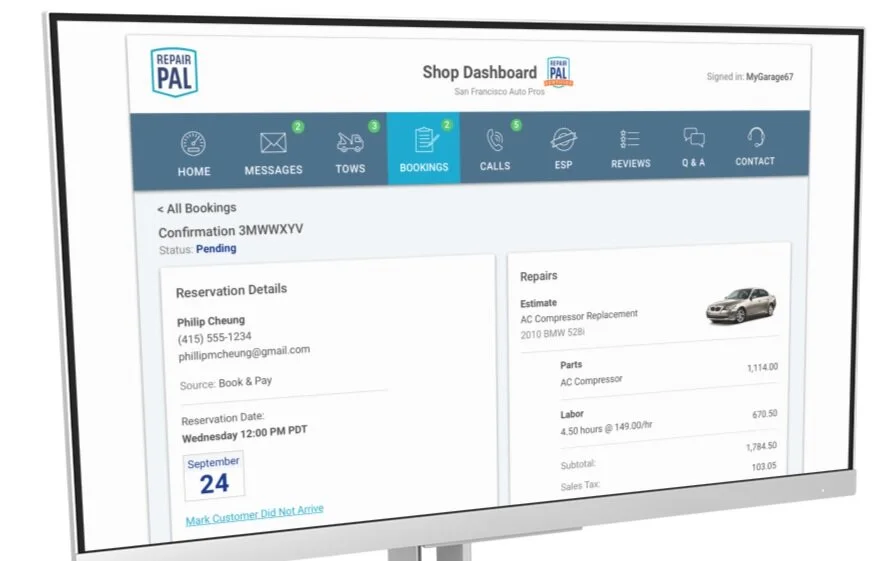
Bookings – desktop (individual booking info page)
Bookings – mobile
Calls – desktop
Call playback can be scrubbed for ease of use. Expand/collapse area for individual call notes, for training purposes
Calls – mobile
Listen to calls while on-the-go
Future Design Development
Ideally (but lacking company resources) the solution would have included development a native mobile app, in order to take advantage of
More timely new lead notifications and message response
Biometric identification for security, protection of shops’ customer PII, and ease of sign-in
A built-in VIN decoder for quick intake of new customer vehicles (car VINs are 17 digits!)
Push notifications and snooze functionality

Home screen

App activity alerts
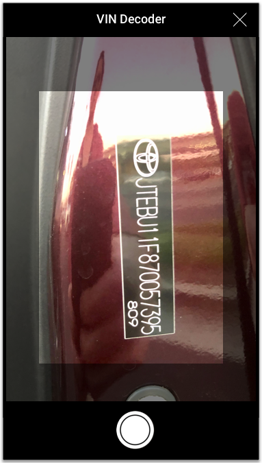
VIN decoder scans 17 digits for car ID
Shop owners frequently request an easy way to track changes in their shop’s NPS (Net Promoted Score). A future Dashboard update will feature an additional card on the Home data visualization page.
Dashboard Launch Introductory Video
Just prior to the nationwide Dashboard rollout, an introductory video, made by RepairPal’s social network manager, was distributed to all Certified Shops in the RepairPal network. View the Dashboard intro video.