Design Problem
The Magic Piano app brings in over 50% of Smule’s annual revenue. App analytics for both Magic Piano iOS and Android platforms revealed some concerning statistics, which were potentially hindering revenue growth and indicated a less-than-optimal experience for new users
A steep dropoff in use over the course of Week 1 after app download, most notably after Day 3
Sessions that lasted an average of only 3 song plays on Day 1
High churn rates in unique daily users, week over week and month over month
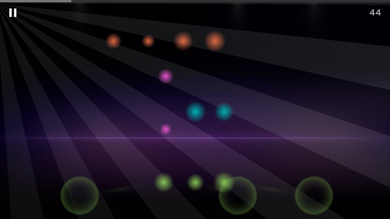
Before launching the new tutorial (shown here) and FTUX, many new users missed that fact that Magic Piano is a multitouch app
Design Direction
Hypothesis: I suspected that inadequate teaching of core mechanics and multi-touch functionality may be contributing to a frustrating first time user experience, lack of confidence and overall dissatisfaction with the app.
Action: On site user testing on both iOS and Android platforms revealed significant problems with the existing FTUX and tutorial:
The tutorial lacked essential instructions and was generally not perceived as a tutorial at all.
25% of users did not immediately understand that Magic Piano is a multitouch app. They attempted to play songs – including the tutorial – by tapping with just one finger, which greatly detracts from the musical experience.
More than half of the testing participants reported that they felt unprepared to continue in the app and play more songs at the conclusion of the tutorial.
Solution
Walk users through the essential core mechanics and multitouch chords in a step-by-step process and avoid front-loading with too much information at any one time. Give positive feedback at each step, so that new users build increasing confidence and want to continue playing.
Break the tutorial into two distinct parts; Part A: Teach the core mechanics. Part B: Immediately reinforce learning by having users apply their newly acquired skills in a short tune, giving hints, and congratulating them at the conclusion.
Give special attention to microcopy for the clearest communication possible.
Introduce multicolor chord types in order to better convey multitouch functionality
Impact Metrics
The release of the redesigned FTUX resulted in
A 7% increase in retention in the first month – the most significant positive impact due to tutorial changes that Magic Piano had ever seen
An increase of Day 1 average song plays from 3 songs to nearly 7
My role: All design discovery and research, UX design, prototyping, user testing, multicolor chord palette and design of new Sing! Jams assets. Most existing app visual assets designed by others.
Process
1a. Preliminary user testing
User testing revealed four distinct needs in the existing tutorial:
Teach essential core mechanics
Build confidence in new users
Demystify chord "splay circles" (a somewhat odd legacy feature that we were required to retain)
Reinforce learning
1b. Additional rounds of user testing
Several rounds of online user testing were conducted to fine-tune the improvements made to issues discovered in preliminary in-house testing. Special attention was paid to exact wording, and the process was repeated until I was satisfied that nearly all testing participants truly understood the basics of Magic Piano and felt confident proceeding in the app.
2. Teach essential core mechanics
The old FTUX tutorial did not explain when and where to tap the note, and the instructions faded out after only about 3 seconds after app launch, even without any user interaction. Many users were confused when looking at the following screens.
Old tutorial: No information about when or where to tap. Multitouch chords were never explained.
Old tutorial: Major source of confusion in new users – instructions disappear after a few seconds, even with no user interaction.
After iterating on various text variations in user testing, I replaced the existing launch screen with one that clearly explains when and where to tap. Unlike the previous version, the instructions persist until user interaction has occurred and the note has been tapped in the correct place to dismiss it.
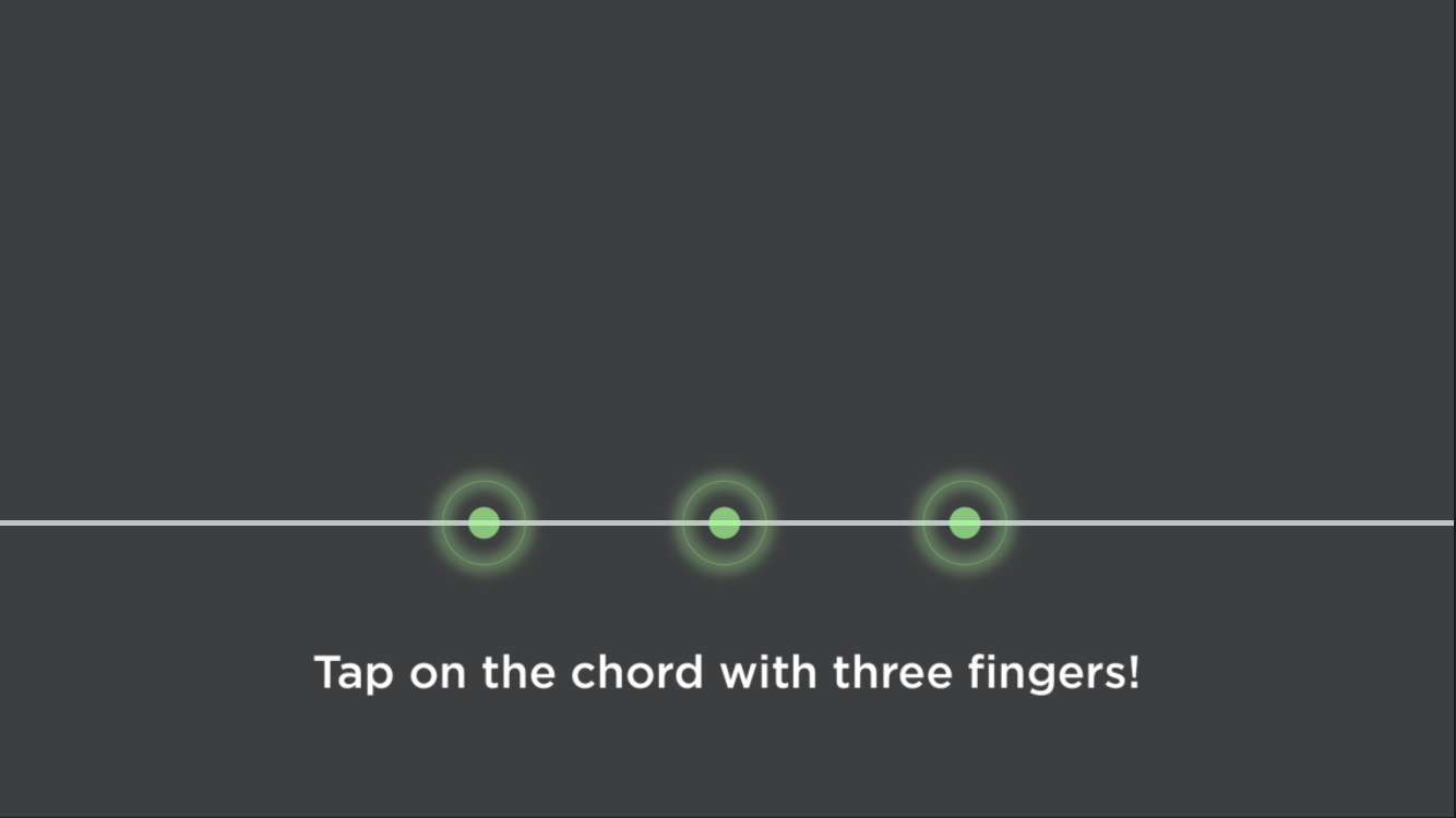
The next task was to adequately instruct users to use multiple fingers to play chords, rather than assume they would automatically figure that out on their own. Two-finger and 3-finger chords were explained. I opted not to include 4-finger chords in the FTUX tutorial, as 4-finger chords exist only in 'difficult' level songs and can easily overwhelm first time users.
Learning was broken down into individual tasks, with step-by-step instructions and increasingly positive feedback at every step so that new users will feel confident and want to continue playing. After trying several text iterations in user testing, the following screens were added.
New tutorial: Instructional text persists on screen until the task has been completed correctly. When and where to tap is explained clearly.
New tutorial: Teaching multi-touch mechanics. One, 2- and 3-finger combinations were taught in successive steps.
3. Build confidence and get them hooked – the science of slot machines
Casinos and slot machines exploit what neuroscientists call Reinforcement Learning. Our brains link rewards to celebratory sights and sounds that we see after completing certain actions. This triggers the release of dopamine and propels us to continue playing. Accordingly, I inserted increasingly positive feedback messages between each step of the tutorial, in order to build confidence and appeal to the addictive nature of game play.
4. Demystify chord "splay circles"
Explain the somewhat odd behavior of what we nicknamed "splay circles" – larger circles that splay out from chords to indicate that chords can be tapped anywhere near the "firefly" notes. (This was a legacy feature in the app that had been there since the app's initial release in 2010, and which we were not allowed to remove.)
"Splay circles" – There was no explanation of these in the previous tutorial.

This turned out to be the most difficult challenge and was resolved through several rounds of user testing with special attention to microcopy. While we aimed to minimize text and visual clutter, we eventually conceded that being as specific as possible was the best solution, since the user only goes through the FTUX one time.
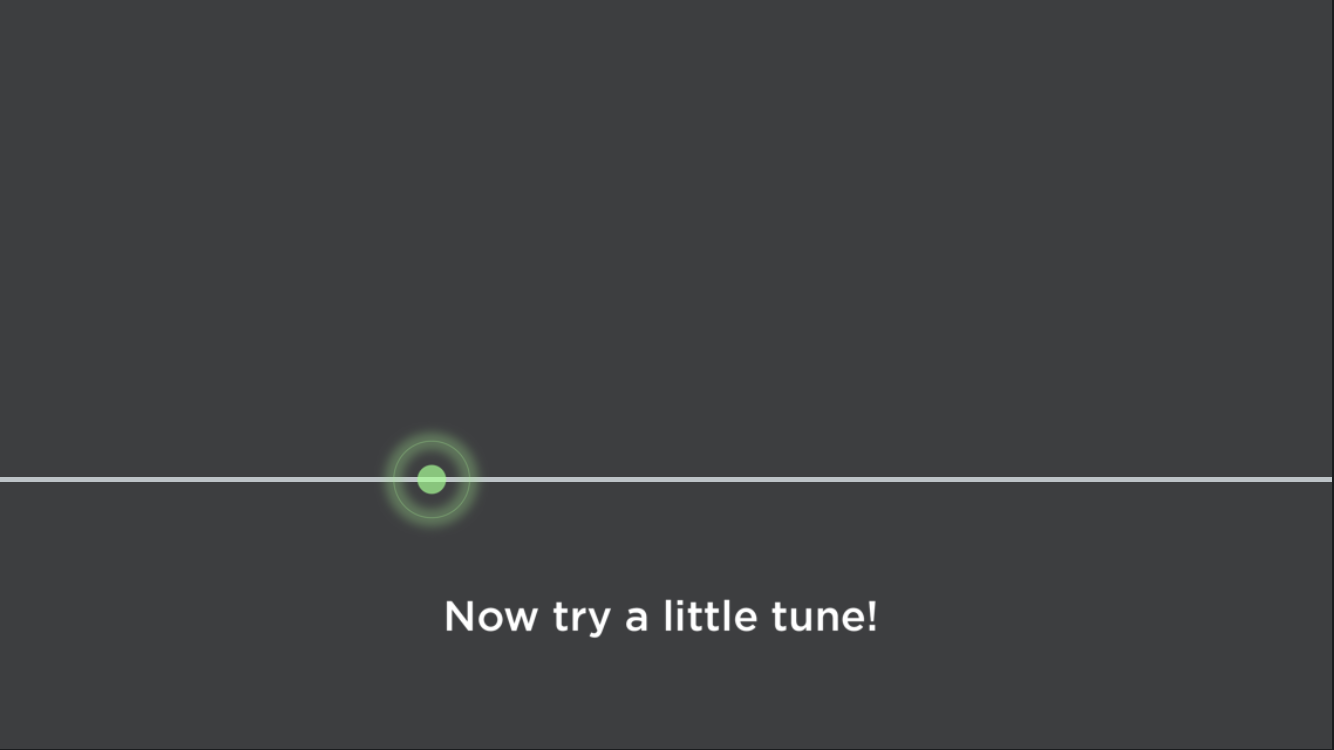
5. Reinforce learning in a practice exercise
Immediately after learning how to play chords, when and where to tap, I prompted users to apply their new skills in a short exercise, while hand-holding and offering hints along the way.
Prompt users for the second half of the tutorial, an exercise in which to practice new skills, then remind them about multitouch chords.
Toward the end of the practice song, remind users about the "splay circle" mechanic of chords.
6. Interactive prototype: Dialing in timing, animations, and overall tutorial length using Pixate
In fine-tuning the overall length and transition animations, I created an interactive prototype for in-house user testing. Check out screen recordings of the Pixate prototype (Note: No audio in prototype).
Tutorial Part A Prototype: Core Mechanics
Click to view prototype screen recording
Tutorial Part B Prototype: Reinforce new skills
Click to view prototype screen recording
7. Specs
Flow detail with specs for the developer
Complete tutorial flows and specs
Click image to enlarge
8. Add multicolored chords for better multitouch comprehension and chord type distinction
Previous 2-color chords
New 4-color chords
Challenge
Shortly after the release of the new tutorial, we addressed on other issue within core gameplay – multicolored chords. Since the launch of the original iPad app in 2010, chords were color coded as follows:
Single notes were green
2-note, 3-note and 4-note chords were all yellow-green
Solution
Assign a unique color to each of the 1- 2- 3- and 4-note combinations. Why? Color is one of the most quickly-perceived qualities by the brain, and the visual cues are quickly translated from sensory input to motor response in the fingers.
The new color palette was helpful to two different types of users:
New users who were just getting used to the multi-touch mechanic
Experienced users who play fast-tempo difficult songs and must switch between 1- 2- 3- and 4-note combinations at a high rate of speed. Yellow chords clustered closely together were difficult to distinguish from one another, and power users frequently complained about it.
A/B Testing
I created 4 unique sets of multi-touch chord color combinations – including the original 2-color yellow and green combination – which we then A/B tested in four separate test cells. The clear winner was then implemented in the next release and was extremely well-received in App store and Google Play reviews.
9. Apply learnings from the app FTUX redesign to a new in-app product called Sing! Jams
Sing! Jams FTUX
I designed a similar two-part tutorial for a special feature in Magic Piano called Sing Jams, that has a different core mechanic than other songs in the app. You may view a video of the tutorial at the top of this page.
Sing Jams requires a user to play in time with a pre-recorded singer from the Sing! Karaoke app, and does not allow for the user to control the tempo. This significant difference in core mechanics needs to be clearly explained in the tutorial.
There are also completely new interactive elements – swipe-action arpeggios and improvisation sections – that required special instruction and carefully crafted instructional text in order for the core mechanic to be effectively taught.
As with the main app tutorial, many iterations on microcopy, cadence and transitions were designed and tested before the final design was implemented.